A data visualization represents data in a well-defined graphical way, which gives the viewer a better understanding of the nature or specific things, actions, events, people, etc. The choice of the type of visualization and the graphical processing of the visual elements contained in the visualization are two crucial factors that strongly influence the way in which the displayed data will be interpreted. This assignment mainly aims to highlight these two factors.
Postcard #1, Outside - Inside
Postcard #1, Outside - Inside
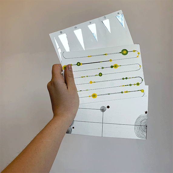
Following the example of Dear Data from Stefanie Posavec and Giorgia Luppi, I visualized data collected by myself on three specific themes during six weeks. The visualizations are drawn completely manually on postcards. One side of the postcard contains the data visualization, the other side contains the legend and personal information.
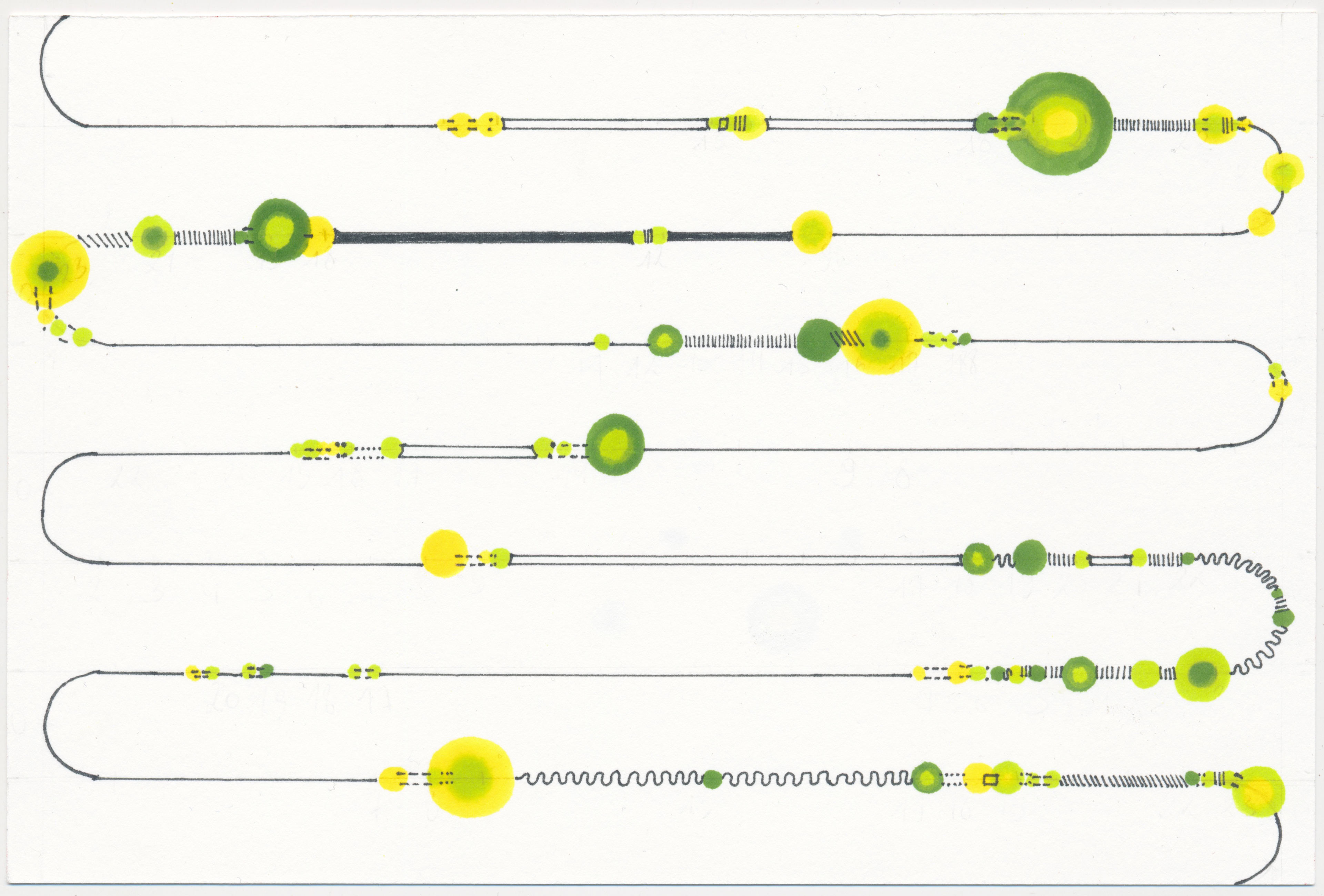
![postcard #2: stimulus [visual]](https://cdn.myportfolio.com/a720ce2a-5aa5-4ea0-8ded-e43289f2f9eb/2cbf8614-79da-431d-961e-490a430a78a3_rw_1920.jpeg?h=958a31b2dd2c7b097a7981276e54a24d)
postcard #2: stimulus [visual]
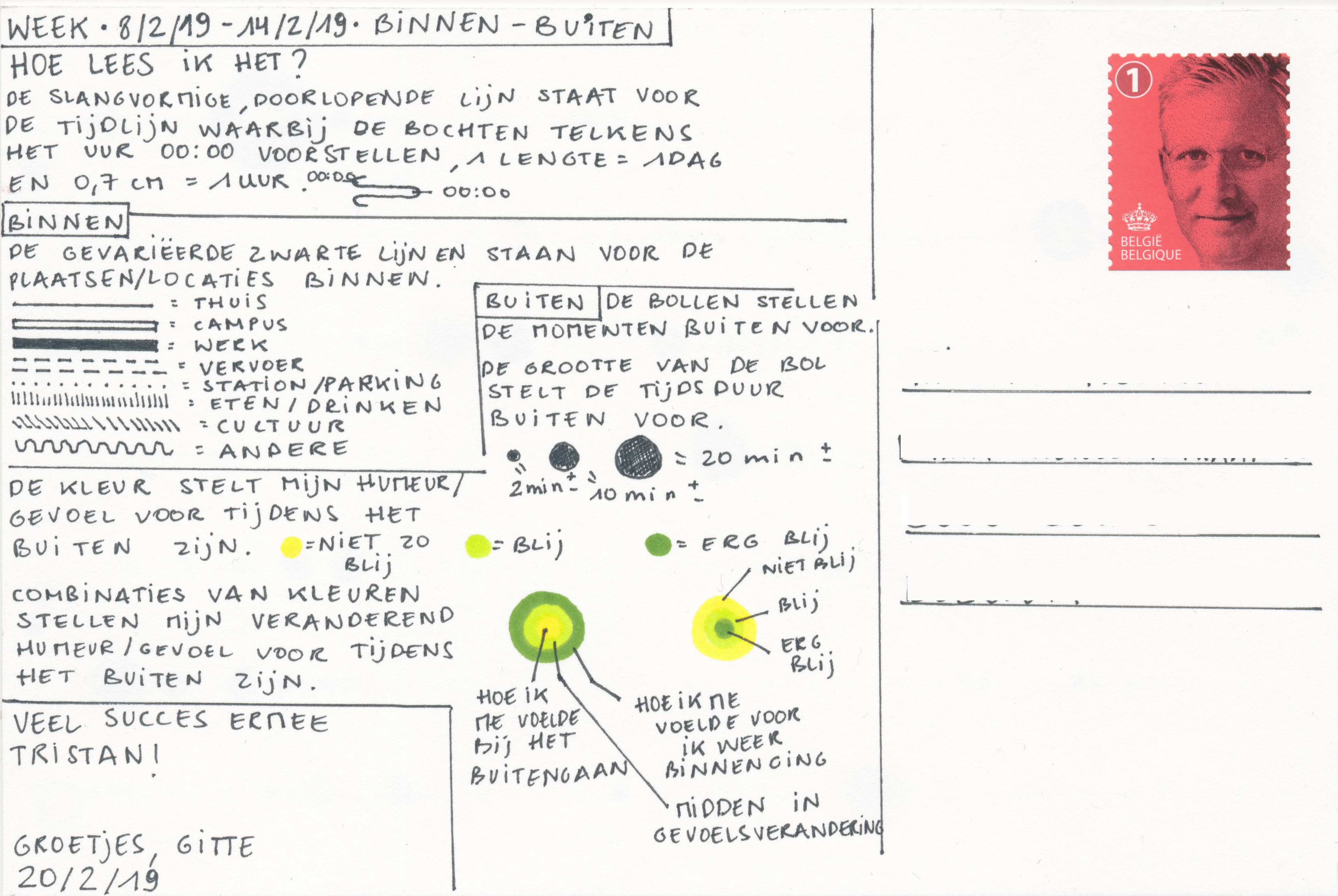
![postcard #2: stimulus [legend]](https://cdn.myportfolio.com/a720ce2a-5aa5-4ea0-8ded-e43289f2f9eb/85ada3a1-f7f2-4b61-b19f-50d30318a806_rw_1920.jpeg?h=5d3c1cda881ca424472b39be2d35fad5)
postcard #2: stimulus [legend]
![postcard #3: garbage [visual]](https://cdn.myportfolio.com/a720ce2a-5aa5-4ea0-8ded-e43289f2f9eb/45e5df02-b7a3-49ac-8fbe-bd7e29910474_rw_1920.jpeg?h=55920f6c6ee974c30bb16f2ce190b156)
postcard #3: garbage [visual]
![postcard #3: garbage [legend]](https://cdn.myportfolio.com/a720ce2a-5aa5-4ea0-8ded-e43289f2f9eb/8d949424-0108-4e0e-a7c9-df0b6902fbd6_rw_1920.jpeg?h=af41439eafb2e4a33eb491bc6bf4d5ba)
postcard #3: garbage [legend]